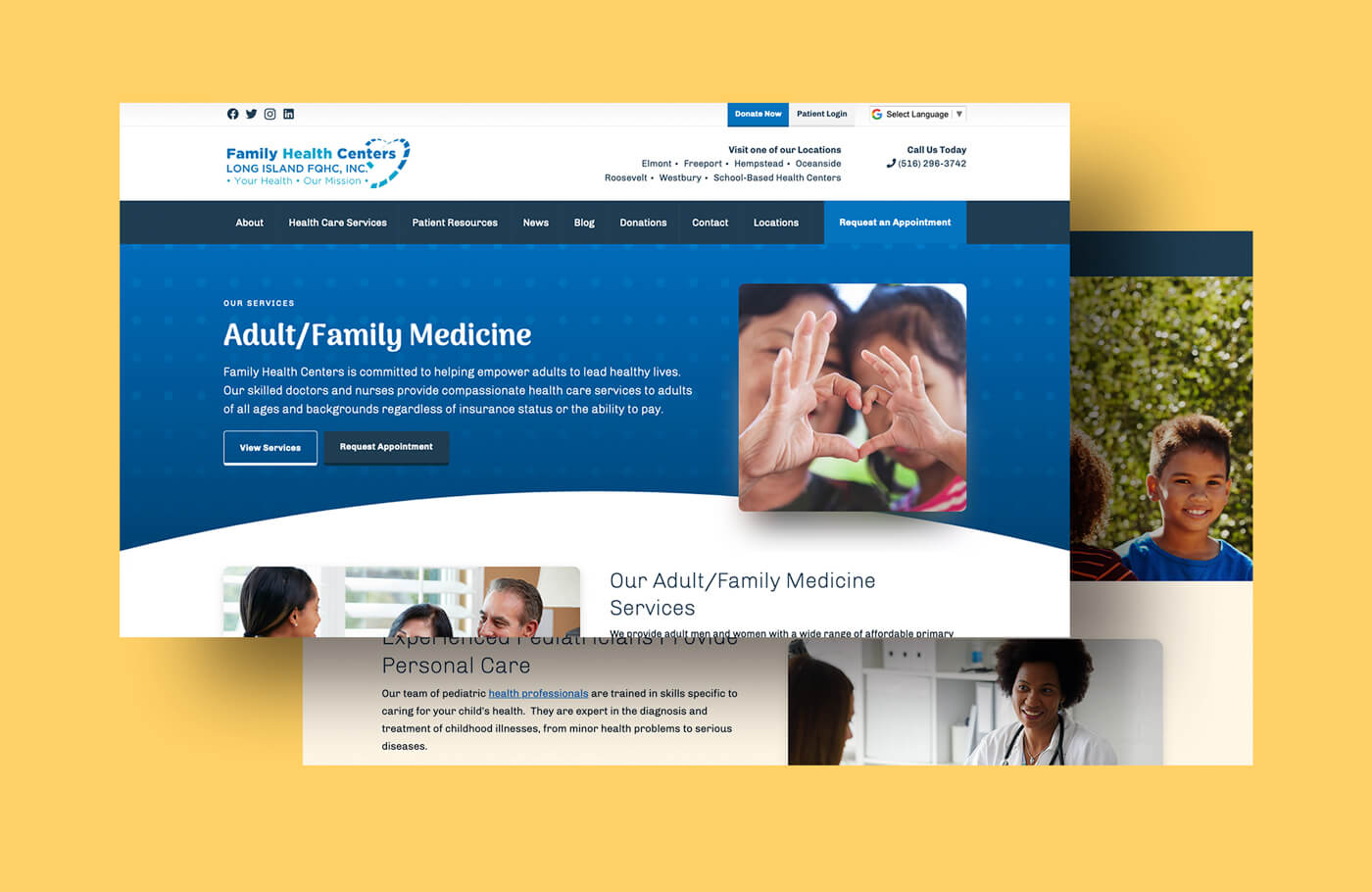
Web Design
Family Health Centers
About the Client
Family Health Centers provides comprehensive primary and preventive health care services across Nassau County. The core of their mission is to provide those services and improve the health status of the community, especially for the underserved and vulnerable, in a financially responsible manner.
Family Health Centers is a Long Island FQHC (Federally Qualified Health Center), and the LIFQHC is a 501(c)(3) charitable organization.
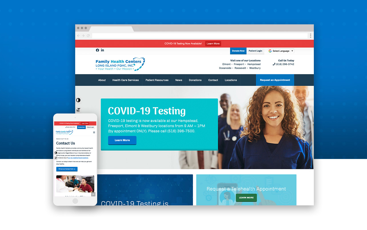
Overview
The Project
- Responsive Web Design & Development, Marketing Designer
- 22 Pages
Team
- Fat Guy Media
- Web Designer
- Account Manager
- Content Writer
- Sales
- Client
Year
- 2020
My Core Tasks
Discover & Define
- Sitemap
- Research: Competitors, Brand Assets,
Design
- Moodboard
- Wireframes
- Graphics Creation
Implementation
- Live Build
- Browser & Responsive Testing
My Primary Toolset
- Microsoft Word
- Microsoft Excel
- Teamwork
- Adobe: XD, Photoshop, Illustrator
- HTML
- CSS
- WordPress
- Google: Analytics, Tag Manager, Search Console
- 3rd Party Extensions
Before
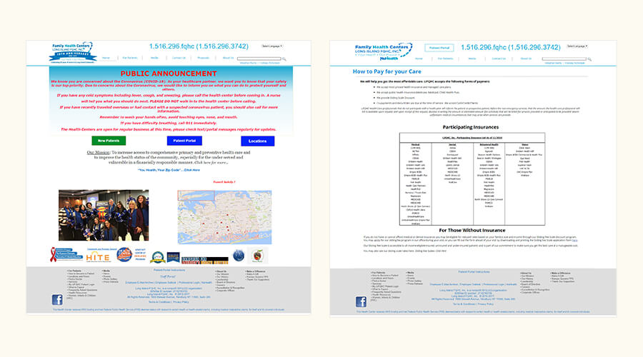
The Challenges
Web Brand Creation
As they previously had no true visual identity for their digital spaces, I used the web design as the core starting point to having a consistent visual identity for users to remember when visiting the Health Centers. As we were starting from scratch, we had to work collaboratively to make sure the visual message was on target for their goals.
The Reasoning
- I created a visual brand focusing on the values of Family Health Centers: community, wellness, local, accessible, welcoming, caring and “for all” – which were the words kept in mind while designing the foundation of their website
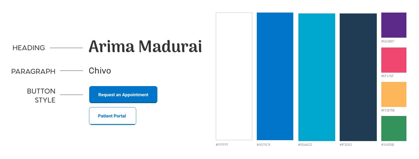
Typography, Color Scheme, and Button Styles
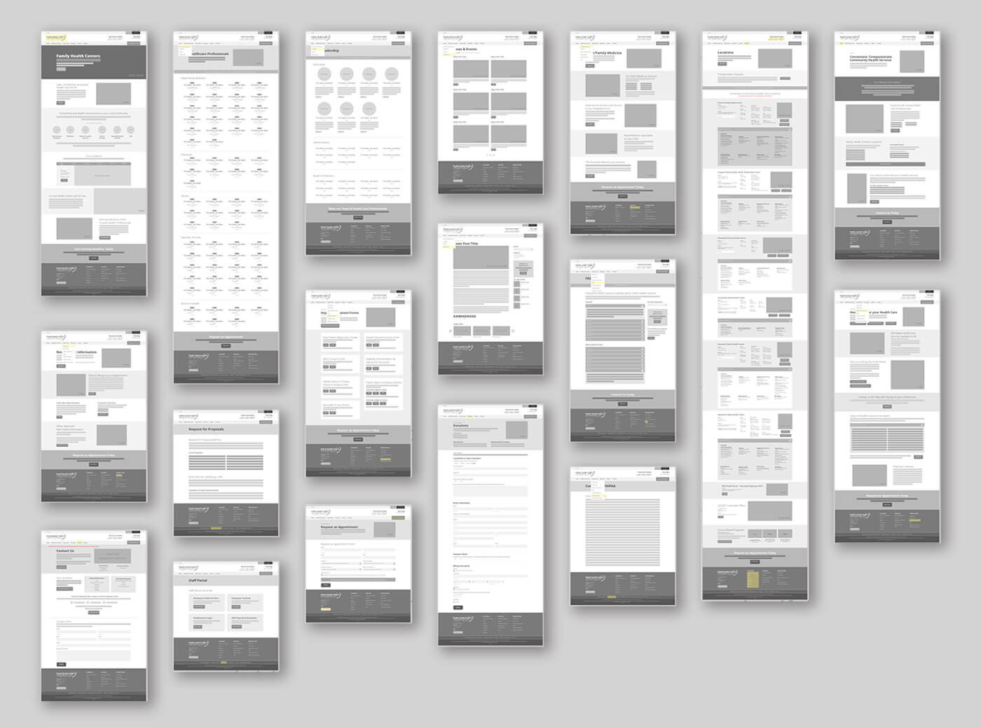
Desktop Low Fidelity Wireframes
The Solution
- Typography: By using an approachable handwritten header and sans-serif body, I was able to convey a friendly and empathetic tone across the site
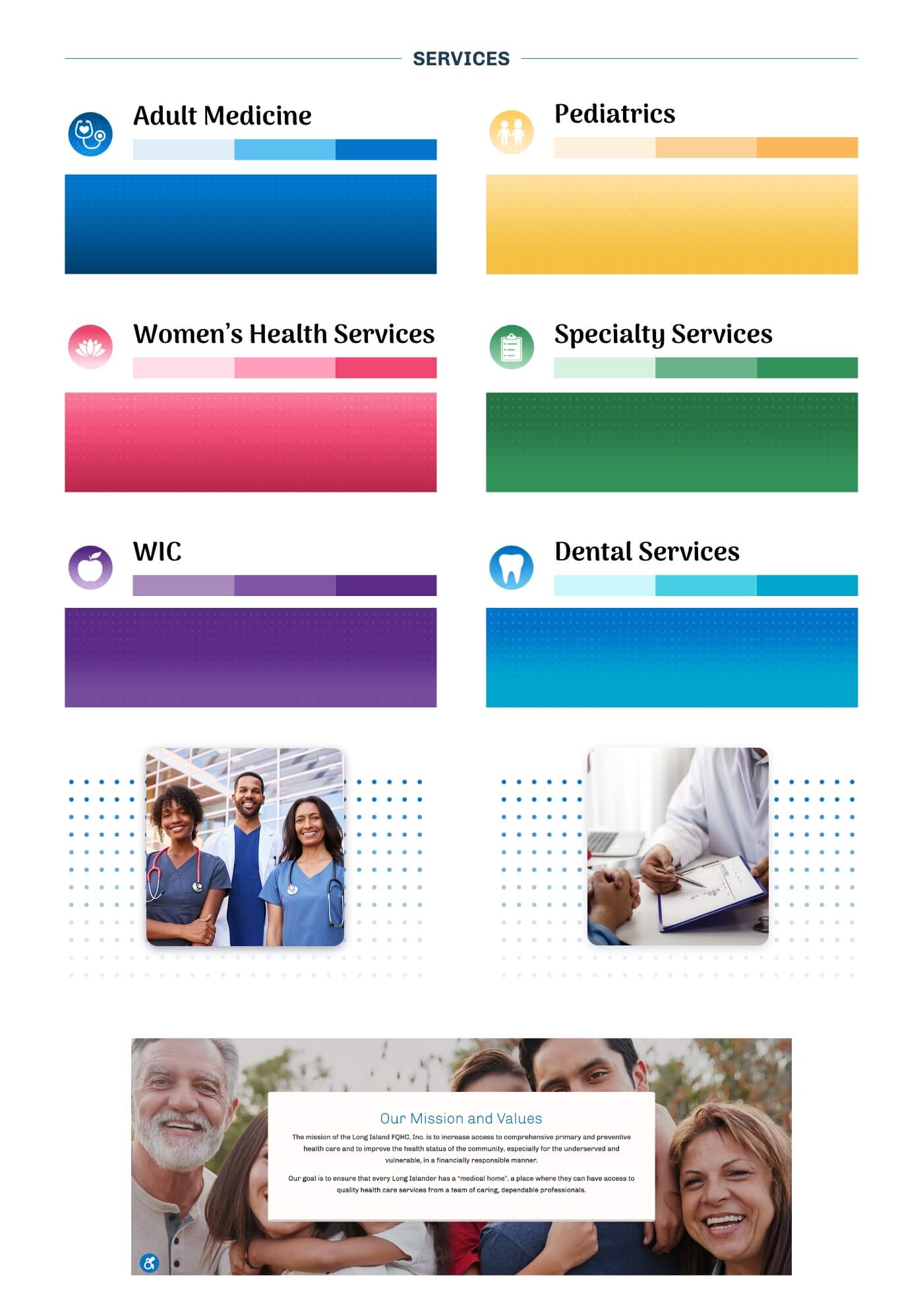
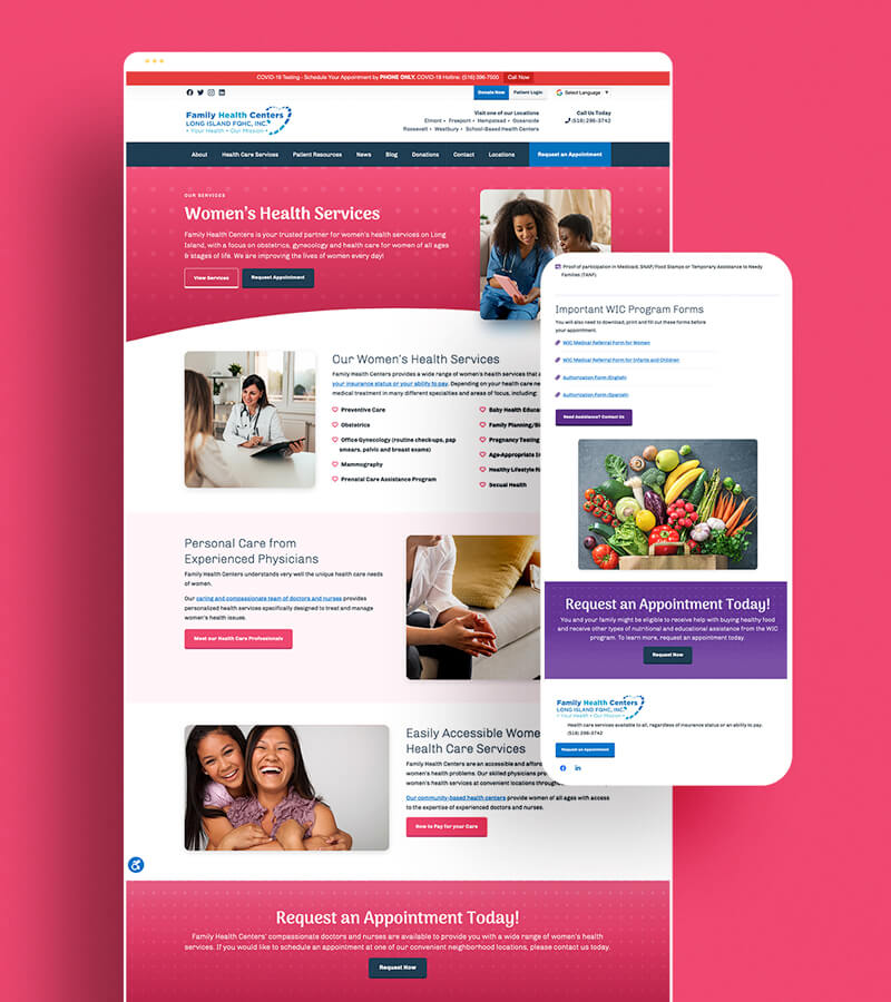
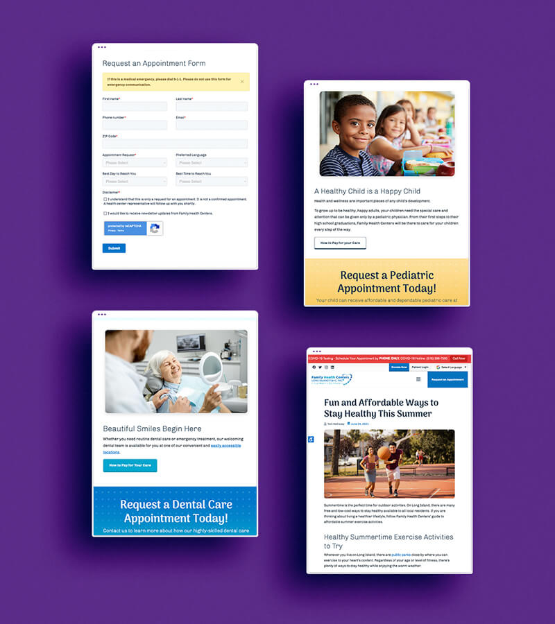
- Colors: By using the core blue of the logo for their primary care services, we created a color-coded scheme for each of the individual services to have identifiers site-wide. Additionally, we used white as the primary accent in order to make the website overall have an approachable feel
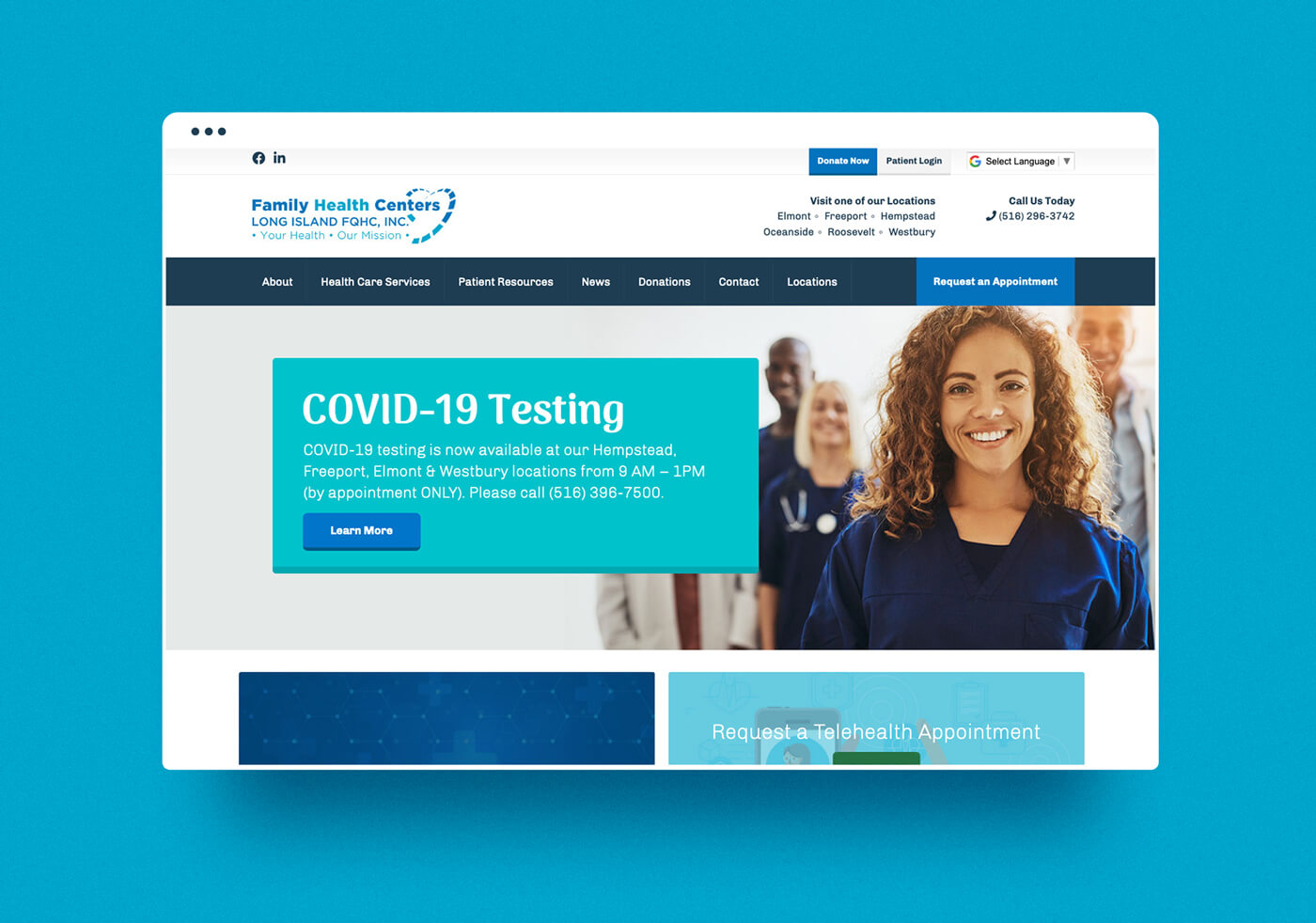
- Layout: Creating layouts that balance the content and showcase the health centers welcoming nature while displaying their mission, locations, and services whenever possible
- User Flow: By taking advantage of the global navigation and footer of the website, I was able to showcase their multiple locations, request an appointment, and highlight their services
The Results
The website has grown with additional pages, provided health resources and news regarding the COVID-19 pandemic as well as other supplementary information. They also have an active blog and news feed on the site directly.
Testimonial
“What a great team! They are creative and innovative and very responsive to our requests or inquiries. They continually monitor and update our website and social media platforms to keep them current and informative. They have helped grow our visibility exponentially.”
– Peggy, Family Health Centers
Analytic Goals Data:
January 2021 – August 2021
Users: 44K
Sessions: 65K
3200+: Goal Completions
1600+: Request an Appointment Form Submissions
